
datamatch
Winter 2020-2021
This late fall/winter, I decided to join the Design Team for Datamatch, a Harvard-started, fun matchmaking web-application service, now used at ~30 universities and by 80% of the Harvard student body!
Designs for the 2021 are ongoing, but I’ll include some interim low-fidelity prototypes, and some mid/hi-fidelity prototypes I’m considering in the meantime. I’ve had a lot fun interfacing with fellow Design members and our great Design lead to further develop these designs!! :)
stage 0: what is datamatch?
As mentioned earlier, Datamatch is a fun matchmaking web-app service for college students, based at Harvard but expanding to schools nationally (and globally)! It’s most known for its hilarious 20-question match survey, strange humor, and perky design. Oh, and its mysterious algorithm that releases your top “true love” (platonic and/or romantic, depending on your choice) matches on Valentine’s Day in hopes of creating genuine connections! While on campus, Datamatch subsidized free dates up to a certain limit, but COVID-19 has made that difficult… nevertheless, with everyone cooped up inside, Datamatch’s renewed goal for our 2021 cycle is to increase more quality engagement with our platform, and genuine interaction between our users. Let’s dive in!
stage 1: user research
To design feature improvements, our team engaged in both quantitative and qualitative needfinding. Our quantitative data, collected from Datamatch 2020 engagement, indicated 1) a significant number of users who sign up to match, but don’t complete their profiles (no bio or image), as well as 2) a comparatively low number of people who actually hit “Match” and interact with their matches. And, our design team interviewed a variety of users, both Harvard and non-Harvard students, to describe: their purpose of using Datamatch, their expectations (vs. reality) when using it, as well as pain points during the process.
Purpose: users’ purpose for using Datamatch ranged from meeting new people, having fun with the survey, finding romantic interests, to wanting to be matched with someone specific!
Expectations & Reality: some people expected to form genuine connections with their (match)es, but many matches didn’t have much information (lack of bio, only social media links, no pic, etc.) that it was harder to communicate or reach out at all. Some people also mentioned adding more personal info fields would be helpful (interests, commitment, etc.)
Pain points: across those we interviewed, many of them expressed worry about proactively matching someone, un-intuitive navigation of our site and access to chats, as well as lack of engagement in the platform.
So, we boiled down this feedback to 3 core issues to focus on, and potential solutions from prior brainstorming sessions that involved the entire Datamatch team (across Business, Stats, Algorithm, Web Dev, Design, etc)!
Make it easier for people to provide information about themselves.
profile flow redesign, social media sync
Lower the barrier to matching, conversation & engagement.
notifications, improved messaging center
Work with personal preferences.
crush “roulette,” more personal indicators
Next, we each chose features to work on that related to these issues!
stage 2: feature specification
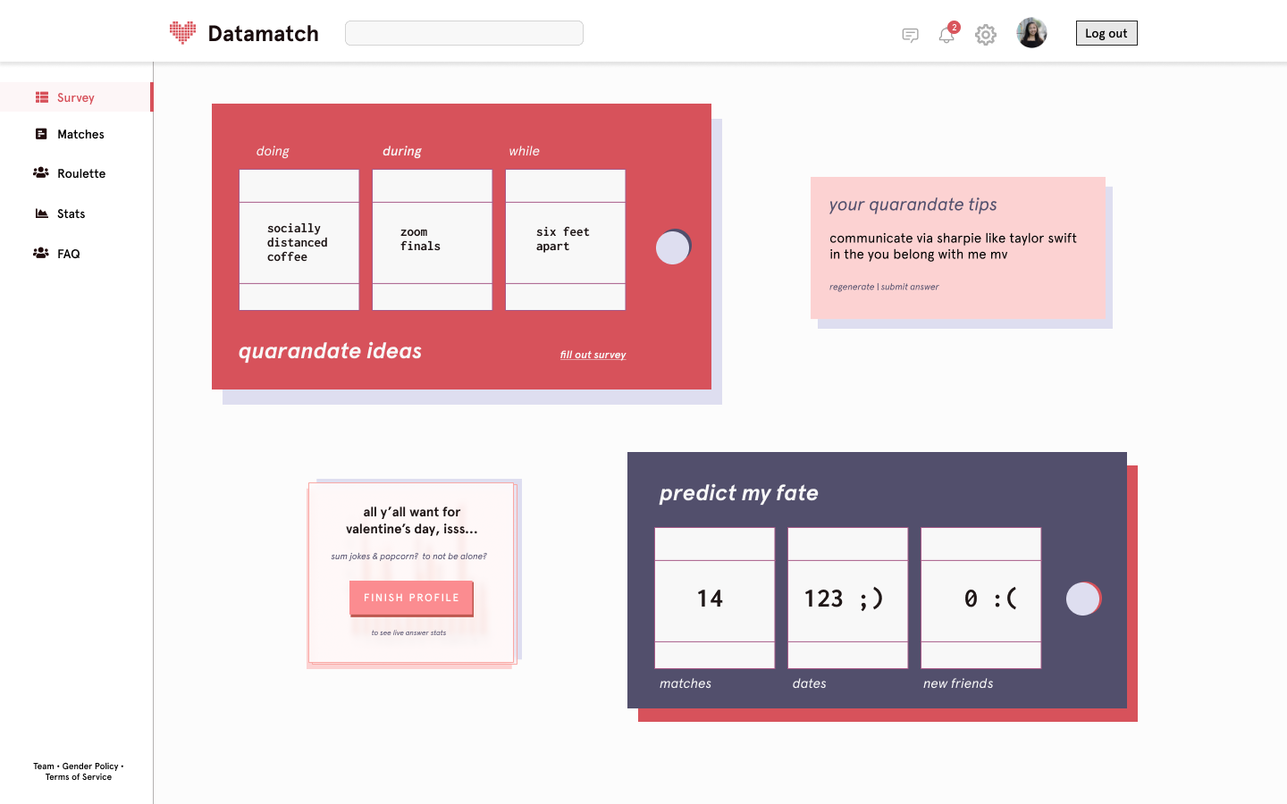
I decided to work on Notifications, so my idea was initially to have a “journey” map on a new homepage that would remind users to complete certain steps in the Datamatch process, from filling out profiles to participating in our new Crush Roulette. Check out my first written “prototype” on the need for the feature, initial design, and further considerations!
stage 3: prototyping
After further discussion with the Design team and other Datamatch members, my project ended up splitting into a notification bar and a separate homepage, which both address the first two pain points and other smaller issues users had mentioned. I first did some quick pen sketches in OneNote before moving on to mockups in Figma.
before-match landing page (try #1)
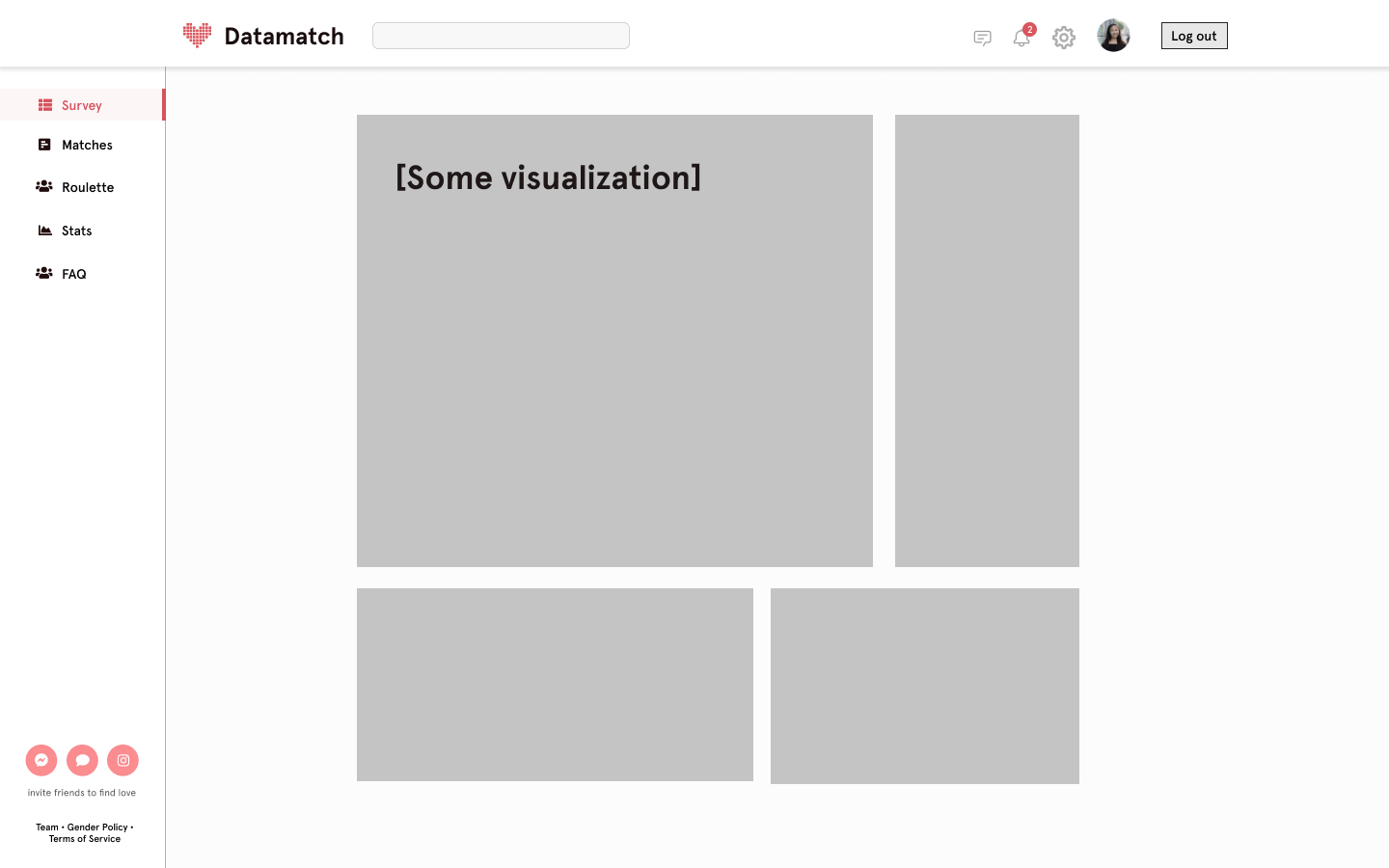
I first did some iterations of more complicated dashboard homepages, but moved on to try #2, a simpler and more direct design, after receiving feedback this was a little confusing and less feasible to implement.
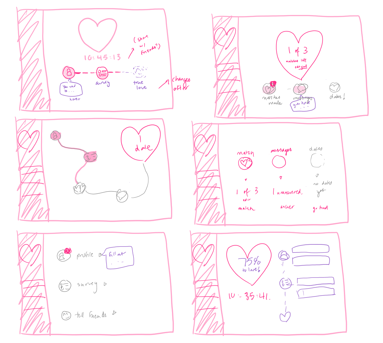
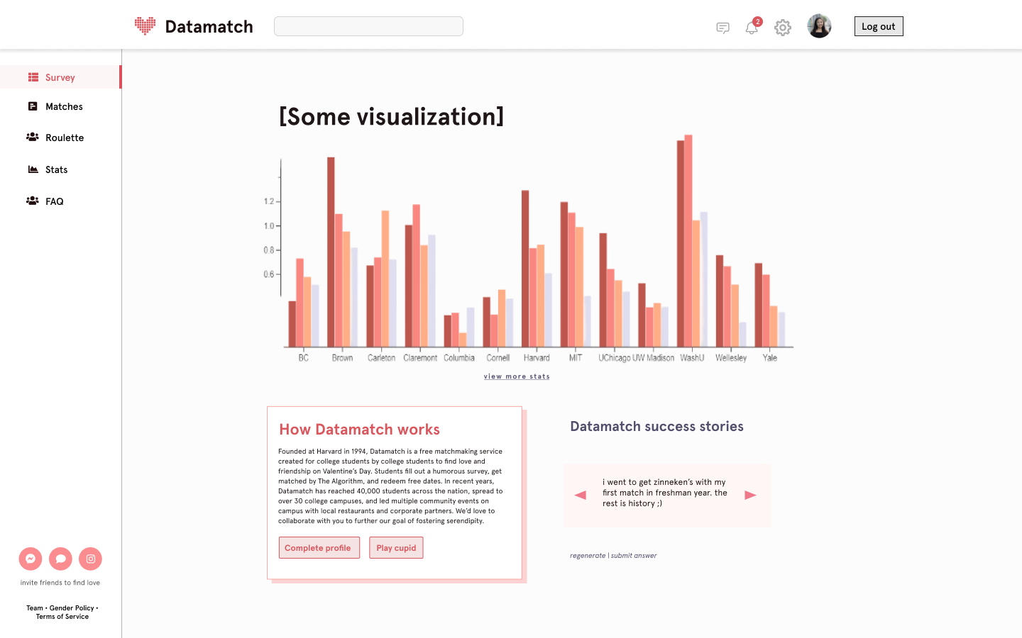
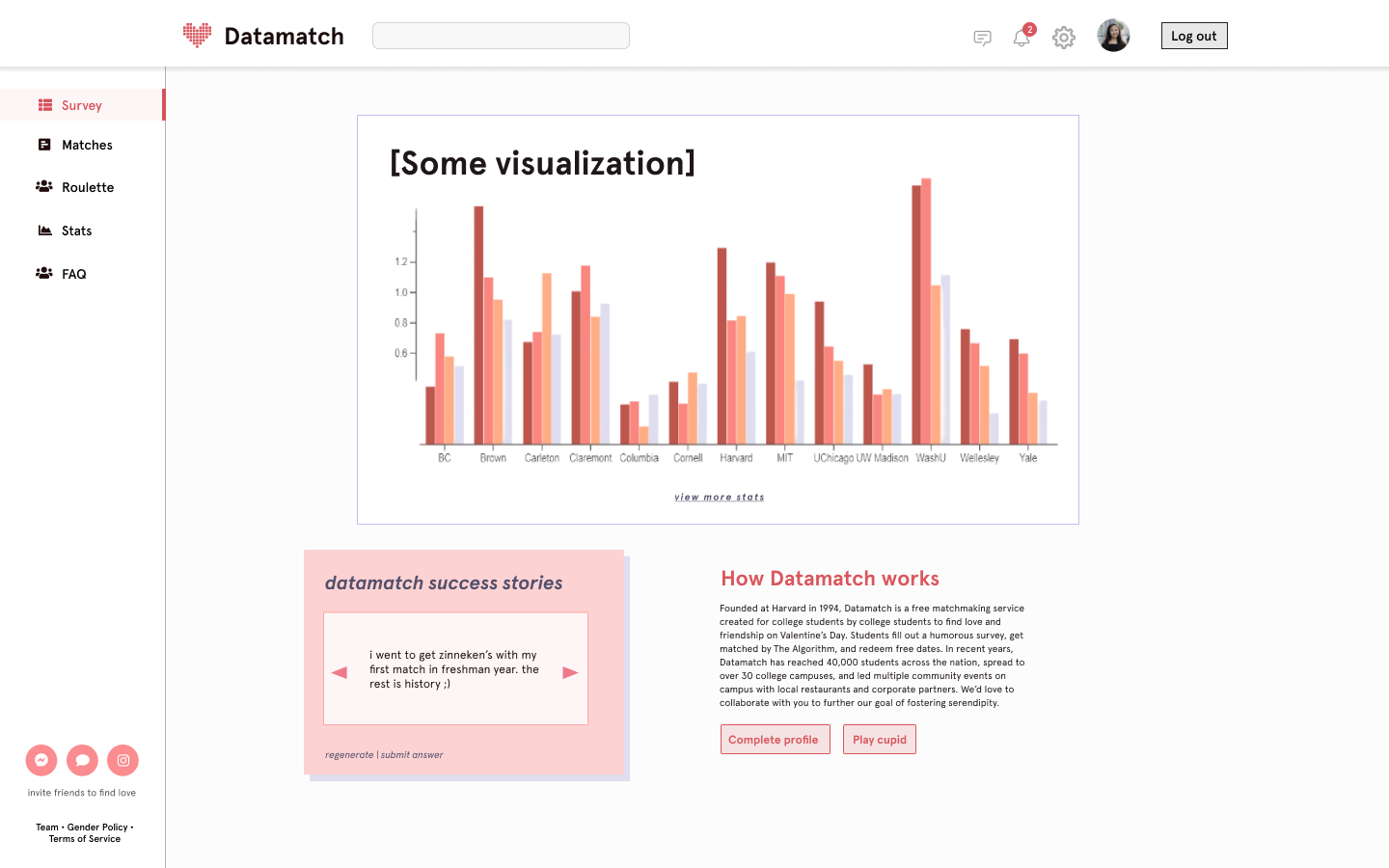
before-match landing page (try #2)
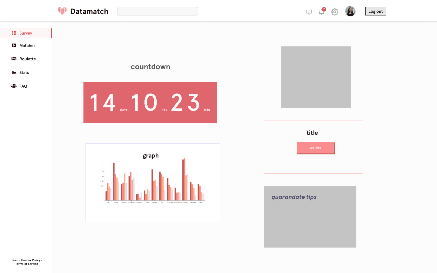
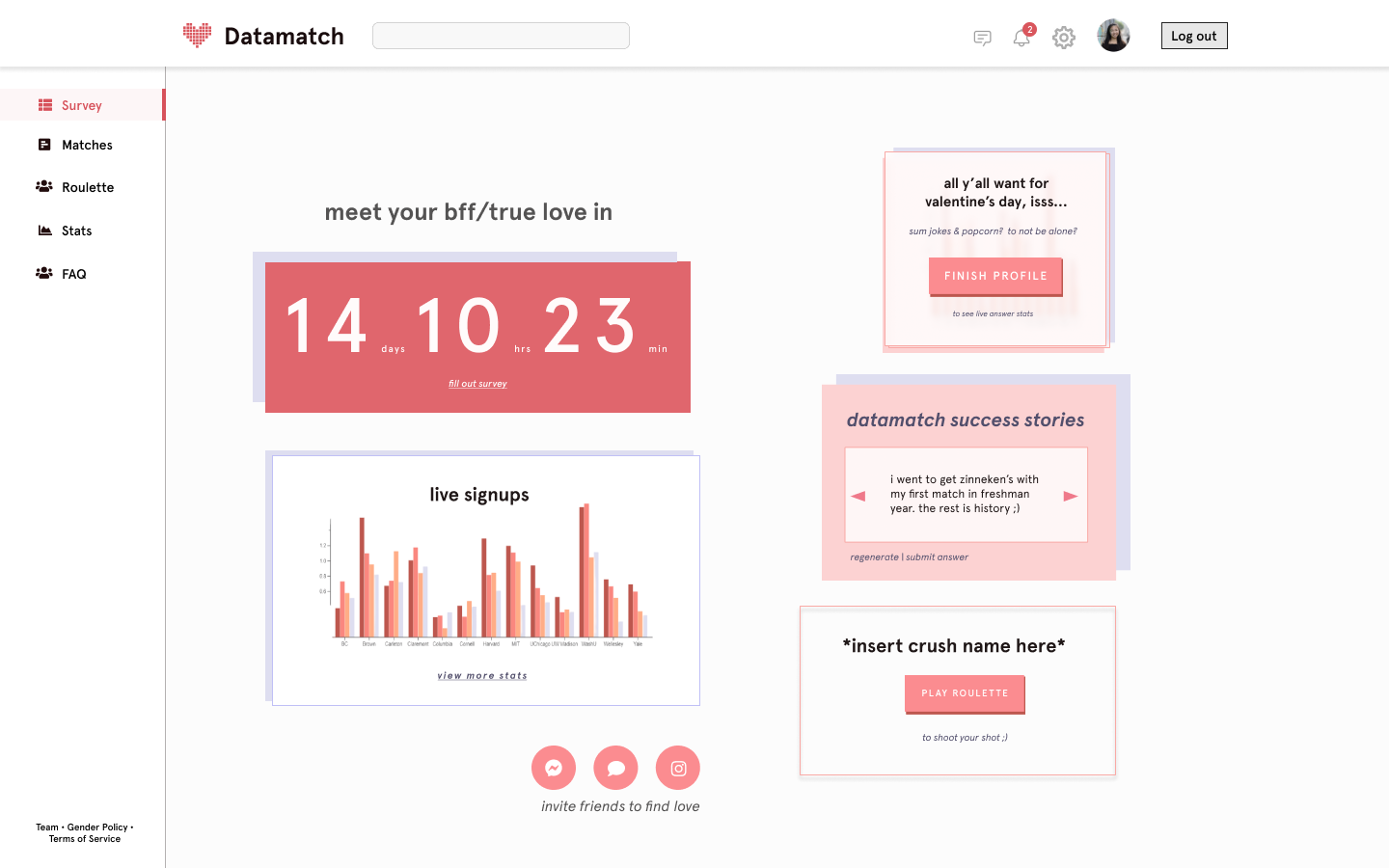
Now, after choosing a core layout (top large element, two smaller ones below), I had to decide how to establish the visual hierarchy among the three: a stat visualization, the information panel, and the success stories panel. We wanted the information panel to stand out the most, even though we wanted the visualization to take up the most space above. At the same time, one of our other concerns was to avoid using too much pink and incorporate other colors in our style guide (namely, the blue-grays, which are more muted). So, I landed on a design that emphasizes the info panel with the usual Datamatch pop-out, accented with pink, and more muted blue-gray on the visualization and stories panel, to establish that hierarchy! Scroll down for the final version (and more on how we decided on these three elements) :D
notifications + misc. ideas
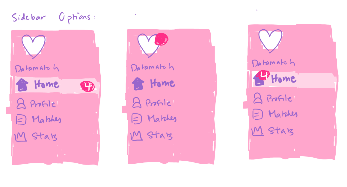
For the notification pop-up rectangles, I first played around with designs that would work directly on a homepage section. However, I had to shift to a design that would work on a notification bar, and one that would be on a top-sticky menu bar (not a left menu bar), which led me to choose a slightly opaque rather than clear design that would stand out on a white notification panel. Moreover, I decided to include the notification icons within the rectangles for a cleaner finish.
After feedback:
I shifted my design to not just include a fun statement, but also a separate underlined, colored action item to direct the user to an action.
I changed the notification rule to have conditional display of some items by priority (ex: Spotify sync only appears after you finish the profile). This was because just displaying all of them, but with priority determined by color of either red (high) or lavender (lower), appeared confusing.
Instead of having a new notification for each match’s new messages, I changed it to one summary notification of total new messages. This was a compromise with the Web team, who mentioned this implementation would be more feasible.
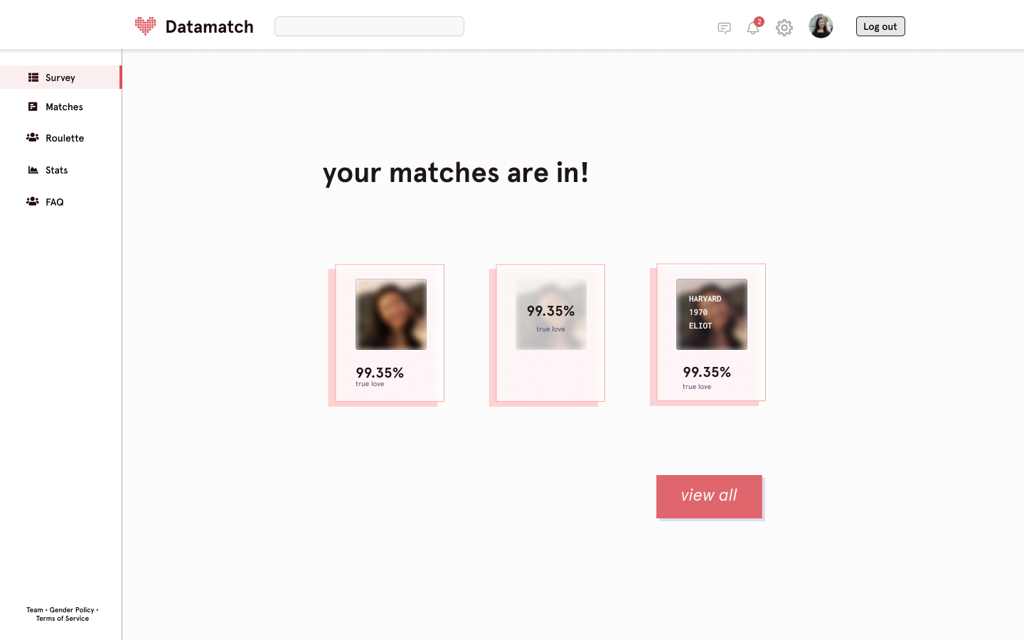
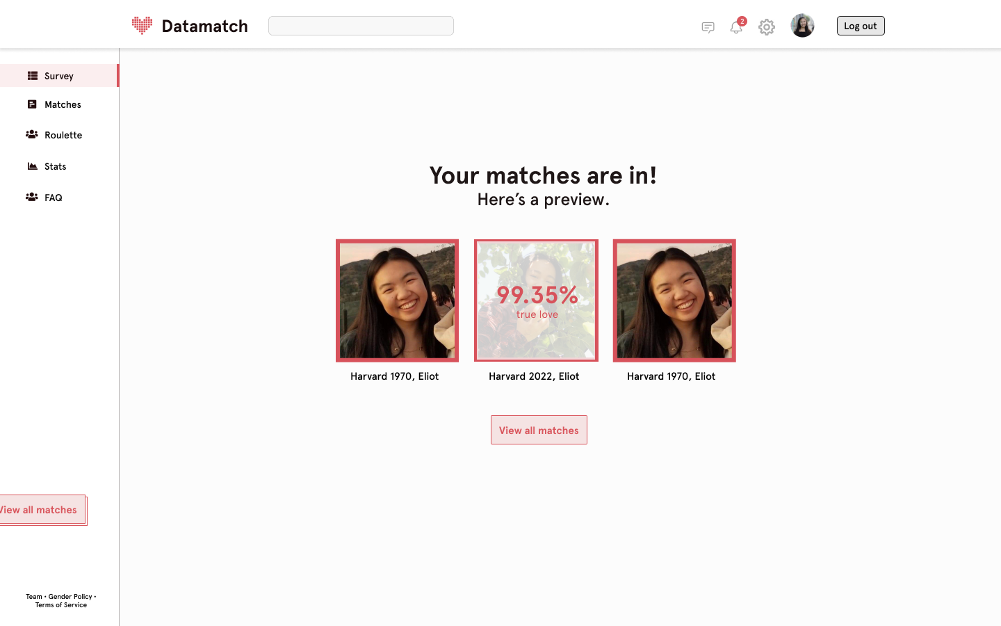
after-match landing page
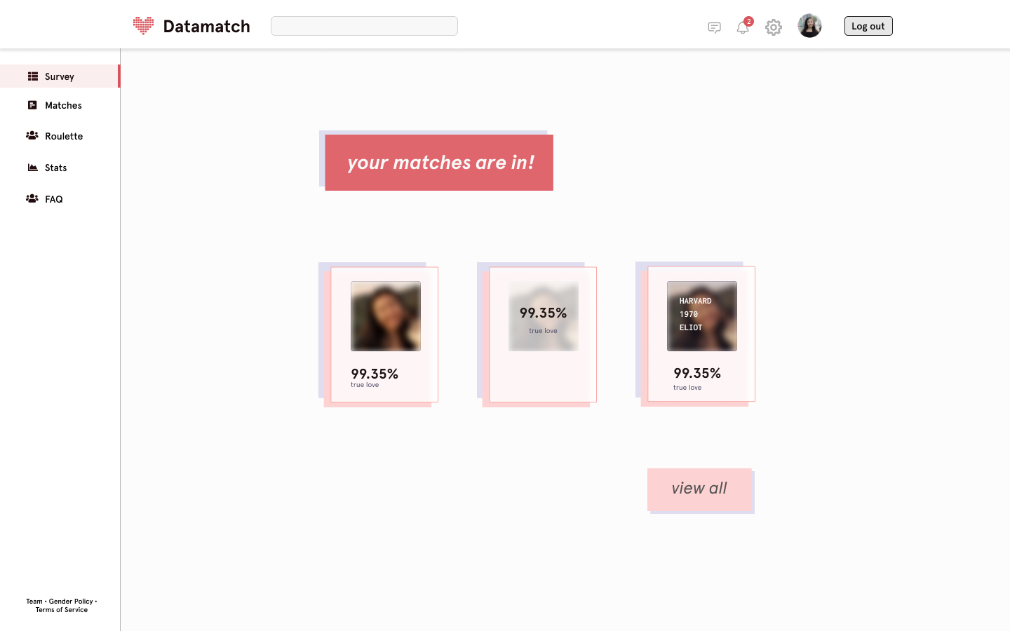
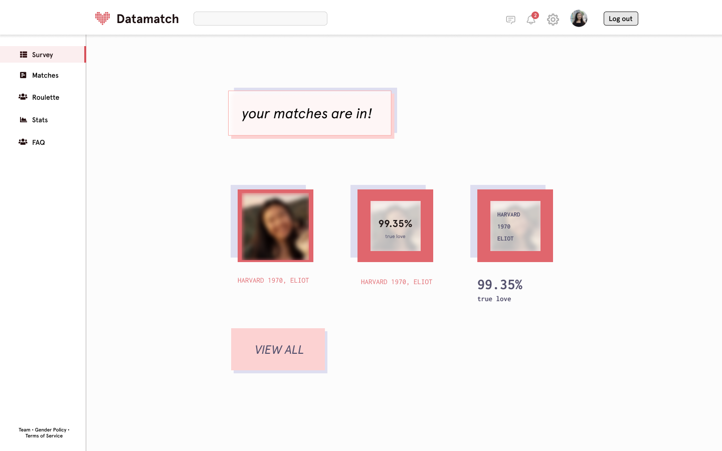
While I personally liked my pastel, layered card designs, I received feedback to make my design more direct/simple, and to better direct users towards the “view all matches” button. This led me to move the % display into a hover state (to also increase engagement), and also make the button centered and darker, instead of emphasizing the top message on a panel. But of course, the final reveal is below :)
stage 4: feedback + final iteration
After our final designs were completed, we presented them to the Datamatch community as a whole, for feedback + handoff to our Web, Algorithm and Stat teams! Here are the notes for what I presented.
a. notifications
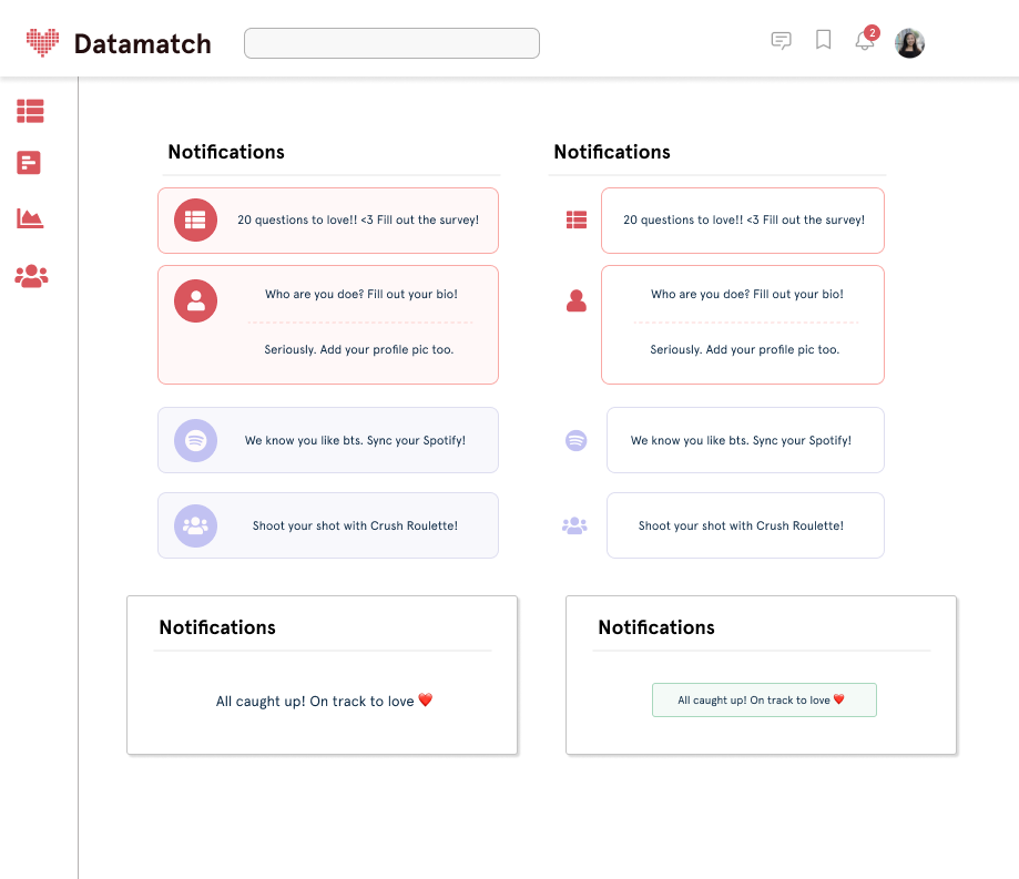
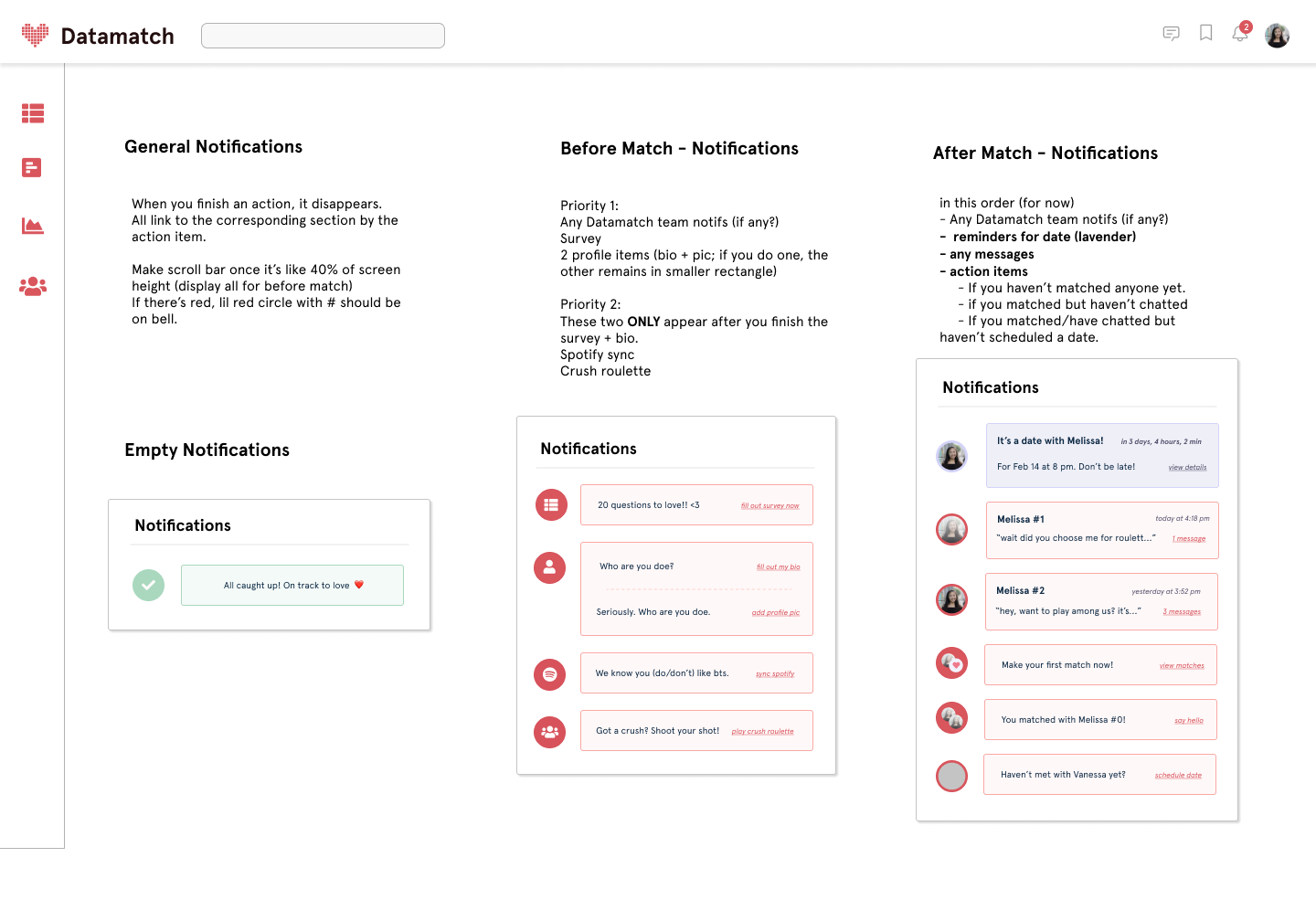
The motivating factor for building in a notification system was the drop-off rate in completing profiles and active engagement with Datamatch. If some of you have used it before, I'm sure you've encountered matches without a profile or even a bio, and you likely wouldn't match with them. Previous feedback indicated it was inconvenient to access messages or know when to do action items in the match process. So, this led to a core decision to have two modes of notifications: before-match, and after-match.
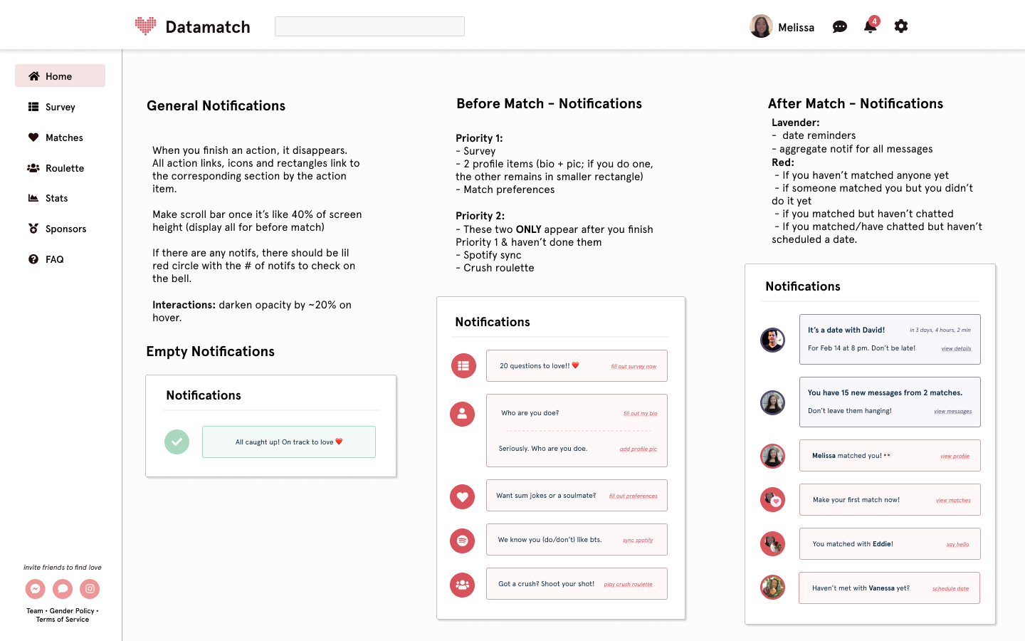
Datamatch 2021 Notifications, by Vanessa Hu.
Before the match, notifications would be presented in order of priority, starting with survey, then the profile, conditionally displaying Spotify sync and Crush Roulette after those are completed.
After the match, there's a similar priority ranking, but for different actions:
Date reminders (lavender at the top)
A summary notification denoting, you have X messages from Y matches.
And, messages that display conditionally: if you haven't made your first match yet, if someone has matched you, if you've both matched each other
And so, the purpose of the notifications is to create a central location to access action items and more intuitive navigation to features of Datamatch. The hopeful impact is to go beyond our great signup rate, and achieve more quality profiles and active engagement.
b. homepage
The motivating factor of the homepage was similar to notifications, the users mentioned navigating the site and understanding Datamatch’s purpose was confusing, leading to less engagement and access to all features. Previously, there was no central location for Datamatch, and logging in would take you to different pages based on whether it was before the match day or after. Moreover, many users had mentioned they were averse to engaging with their matches. To address this, I again broke this up into two designs:
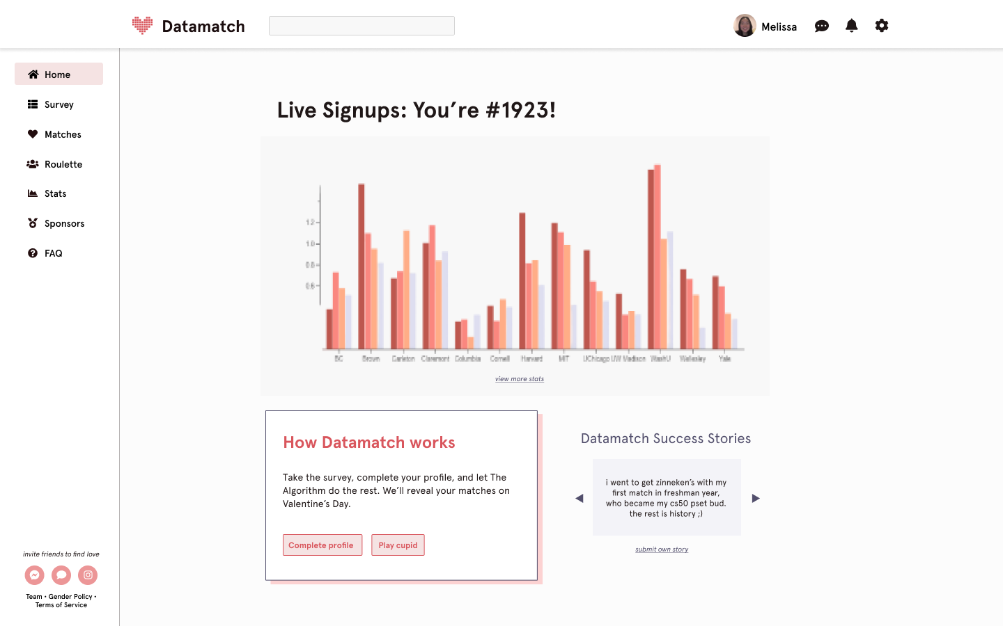
Datamatch 2021 Homepage, Before Match. by Vanessa Hu.
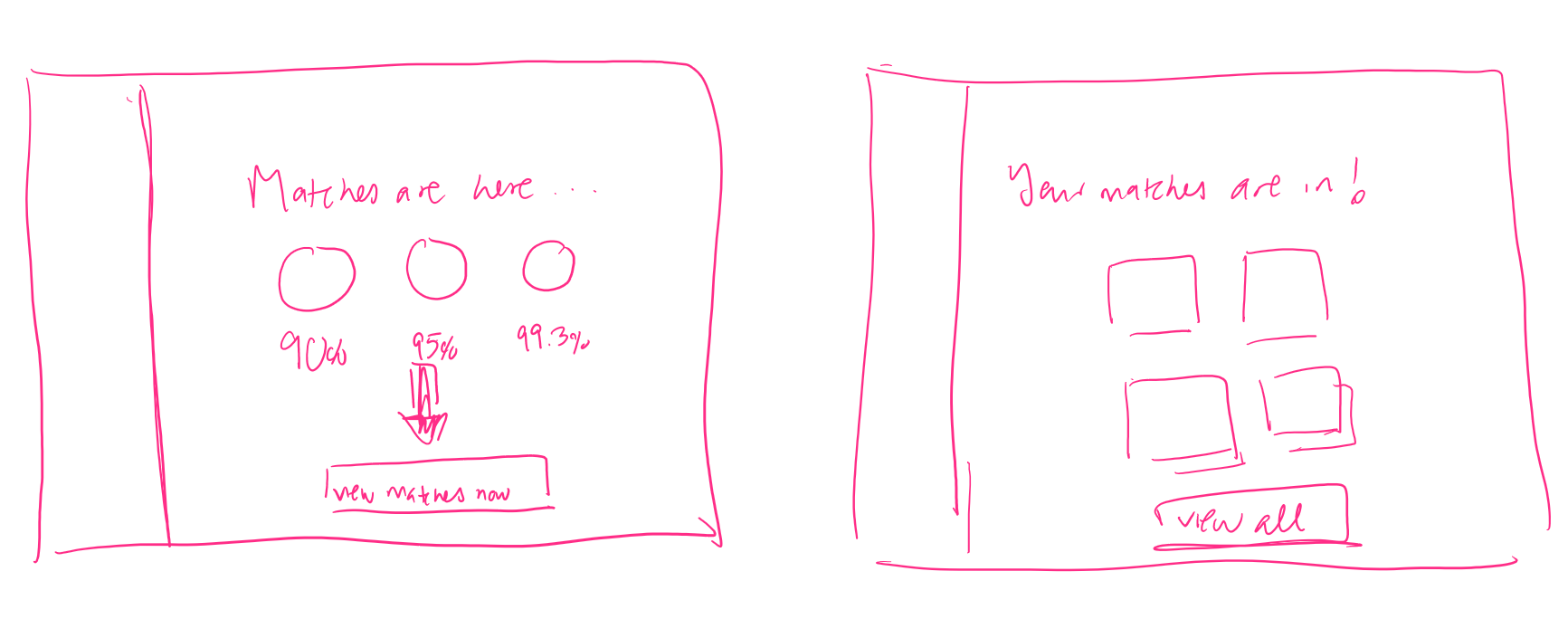
Before match: After some iterations of more complicated dashboard homepages, I landed on something simple to increase both fun and informational engagement in multiple aspects:
A core stat visualization: we wanted to direct more attention to our Stat team’s work, and their interactive visualization for sign-ups would be great to engage users and increase excitement.
An information panel: about Datamatch, the process, as well as action buttons to main Datamatch features
Datamatch Success Stories: a scroll-through panel of actual friend / relationship success stories, again for excitement!
After match: Our main goal is to direct people towards our match pages and create excitement, which is why I landed on a very simple but clear design to feature the blurred images of your top 3 matches, a bit of info about them (school, house, etc.), as well as the interactive portion of your calculated % true love, that appears on hover above each picture frame. And, the darker red button to view matches brings you to your matches page to learn more about them.
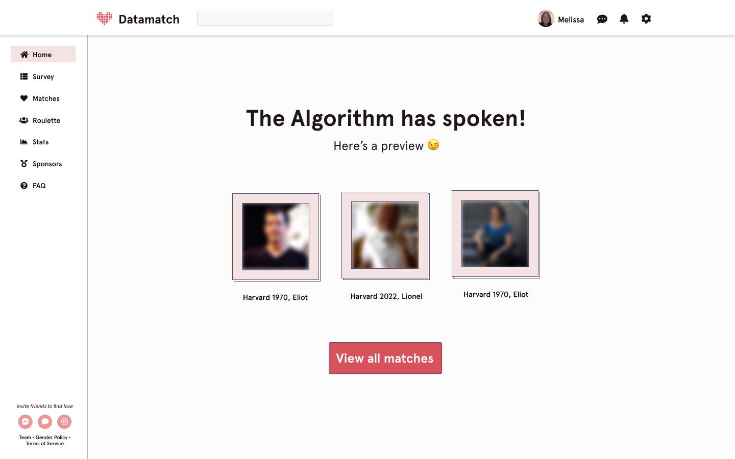
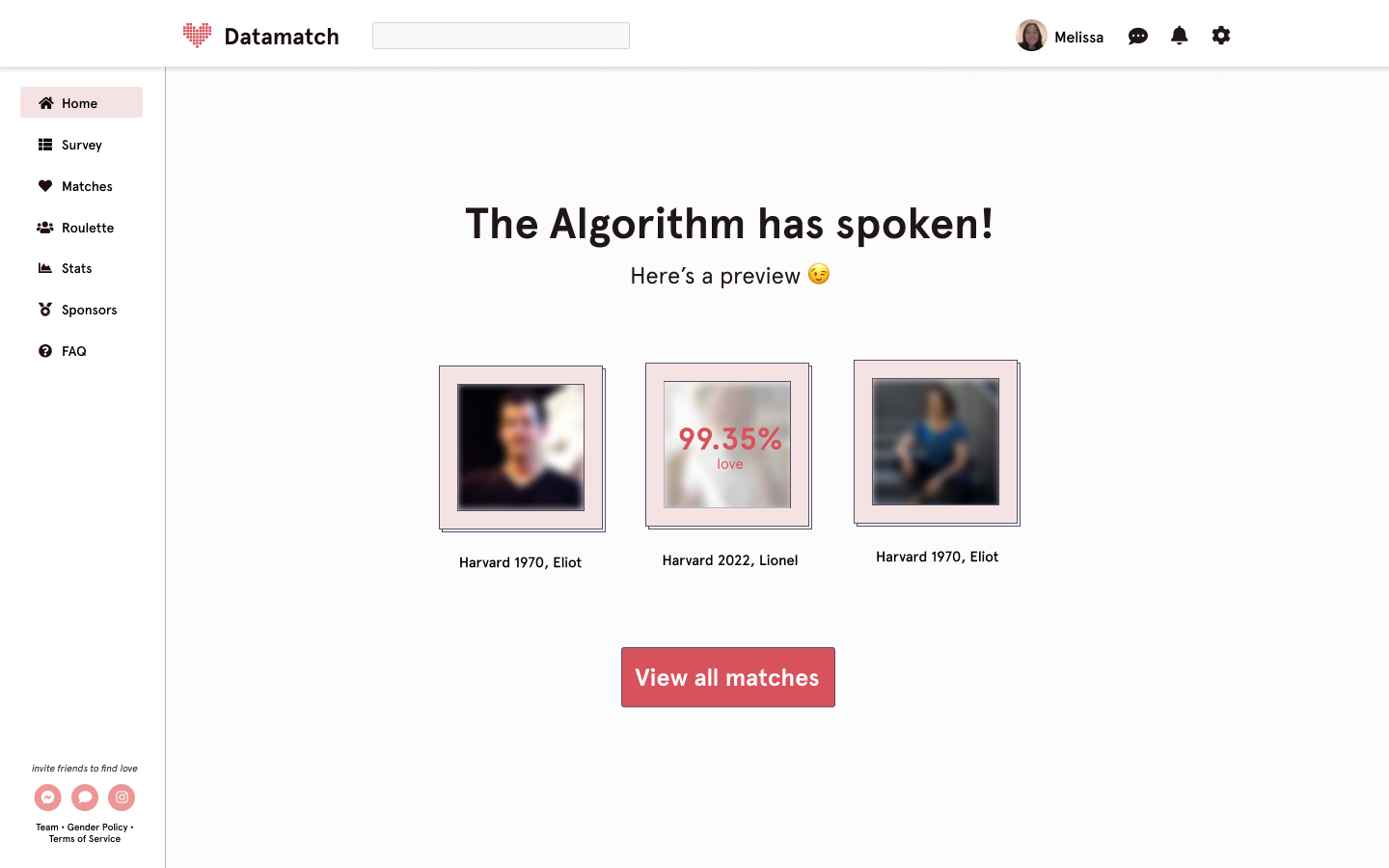
The hopeful impact of both modes is to get people excited about Datamatch and their matches, explore our interface more, and encourage user-user interaction and matching!