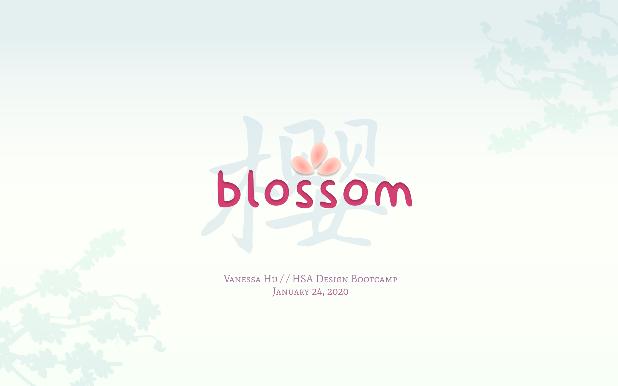
blossom
Completed: January 2020
Harvard UI/UX Bootcamp
This past winter break, while we students were gone from campus for about a month, I decided to return two weeks earlier to dip my toes into UI/UX design through a bootcamp run by Harvard Student Agencies!
During these two weeks, we basically learned the product evaluation model: how to organize design work, which can overall be described in three phases: the concept development, the implementation, and the final product.
concept development
a. what is your why?
Your why is what grounds your design to a central purpose. Why are you making this design? Or, what is your client’s aim in making this design? Whether it’s to excite kids to use a new educational app, or leave an audience enraptured in a beautiful photo portfolio, your why directly contributes to the vision and aesthetic of the design.
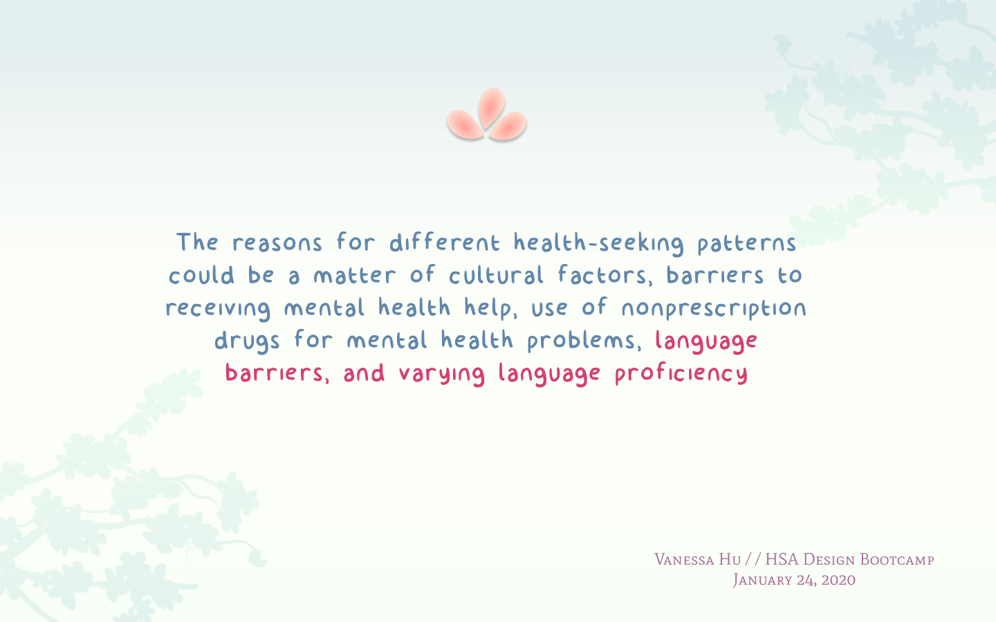
So, my why was Asian women’s health: after learning about the topic from my sister and doing some reading (linked in the caption below), I began to learn of struggles that Asians in America face related to healthcare: check out this study done here. In addition to financial and physical barriers, language is a central barrier to accessing healthcare, from those without any English skills, to those who are proficient as well; because of the difficulty of describing ailments and understanding medical terms. Moreover, due to cultural perceptions and other factors, older Asian women are also less likely to seek medical services, such as mammograms or the OB/GYN.
So, with this budding interest in Asian women’s health, along with my penchant for languages, I decided to design blossom: a bilingual Chinese-English site, dedicated to increasing health literacy and creating a central hub for medical resources and services that offer Chinese.
Appel, H. B., Huang, B., Ai, A. L., & Lin, C. J. (2011). Physical, behavioral, and mental health issues in Asian American women: results from the National Latino Asian American Study. Journal of women's health (2002), 20(11), 1703–1711. https://doi.org/10.1089/jwh.2010.2726
b. aesthetics
Of course, the next step in concept development is to develop an aesthetic: so here is the brand guide for blossom! I wanted a color palette that was soothing, warm and feminine (not bowing down to gender stereotypes, but the Chinese society is more traditional in this sense — I also happen to like all these colors).
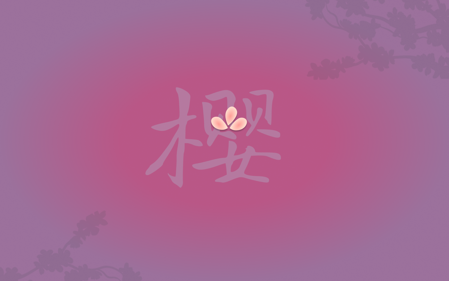
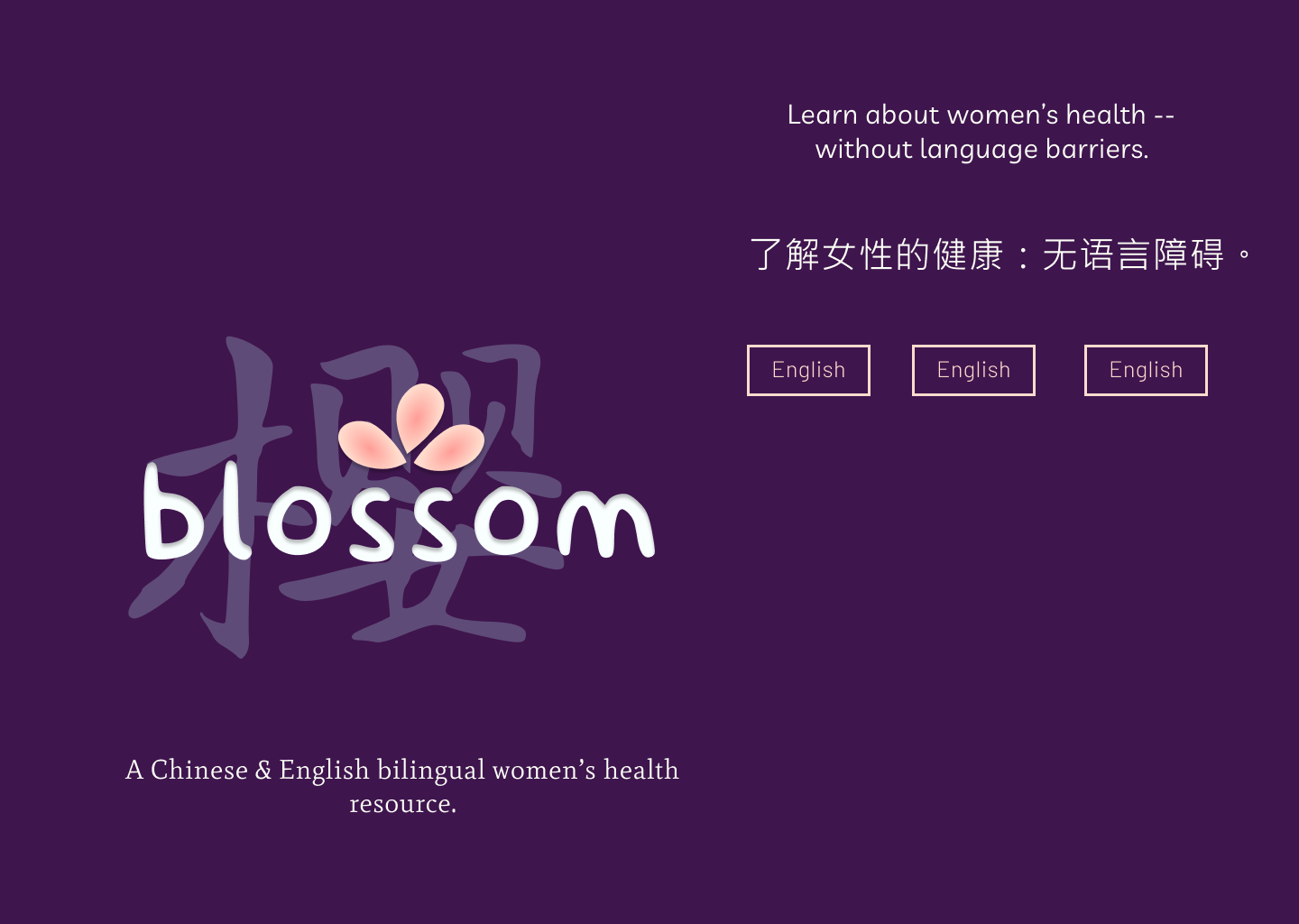
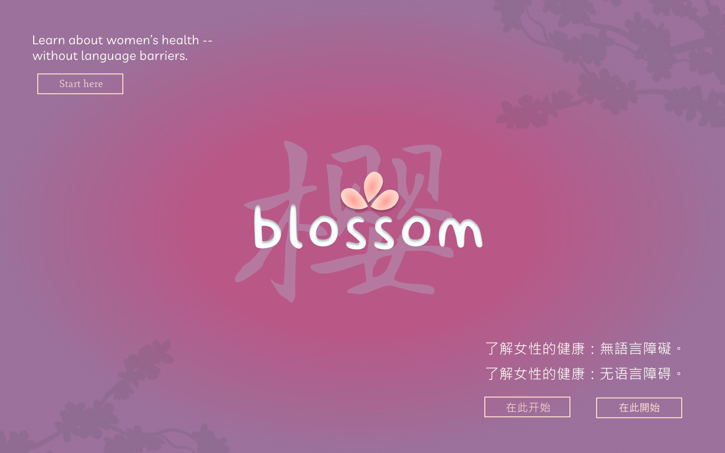
The logo I designed, along with the little petals, has a 樱 character, pointing to cherry blossom — cherry blossoms have been celebrated and admired in Chinese culture since the Tang Dynasty. The left side of the character signifies tree 木, whereas the right side represents a woman 女, “carrying” two characters meaning infant, or treasure 贝贝. So yay, symbolism / flowery nature things!
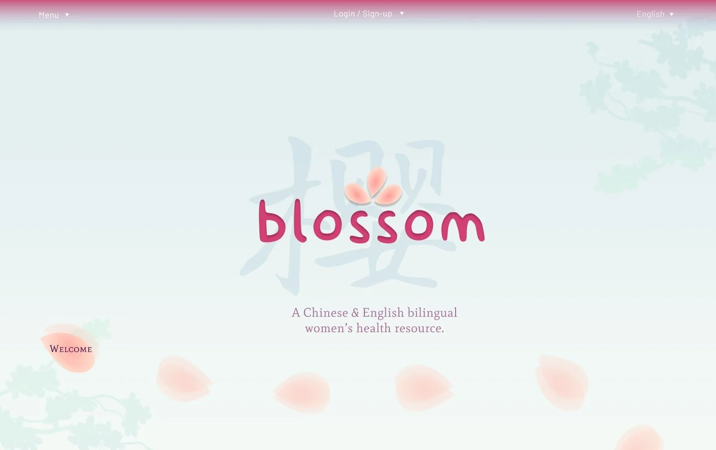
I also added the overlay where the different language modes of the website would have either the Chinese or English popping out of the logo, the other kind of faded in a calligraphy style. Oh, and cute detail I love: the inset shadow to blossom, reminiscent of Chinese cut paper!
A couple notes on fonts: finding fonts was WAY harder than expected, because you want to find “the perfect font”! Trying to find good fonts in other languages was also a bit difficult, but I wound up with a good balance of serif and sans serif.
P.S. You get to name your own colors! After twiddling around on Figma, I ended up with this gorgeous gradient. Ta-da!
3. implementation
a. lo-fis + userflows
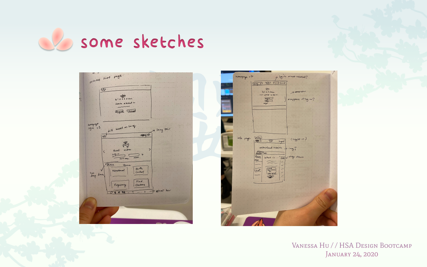
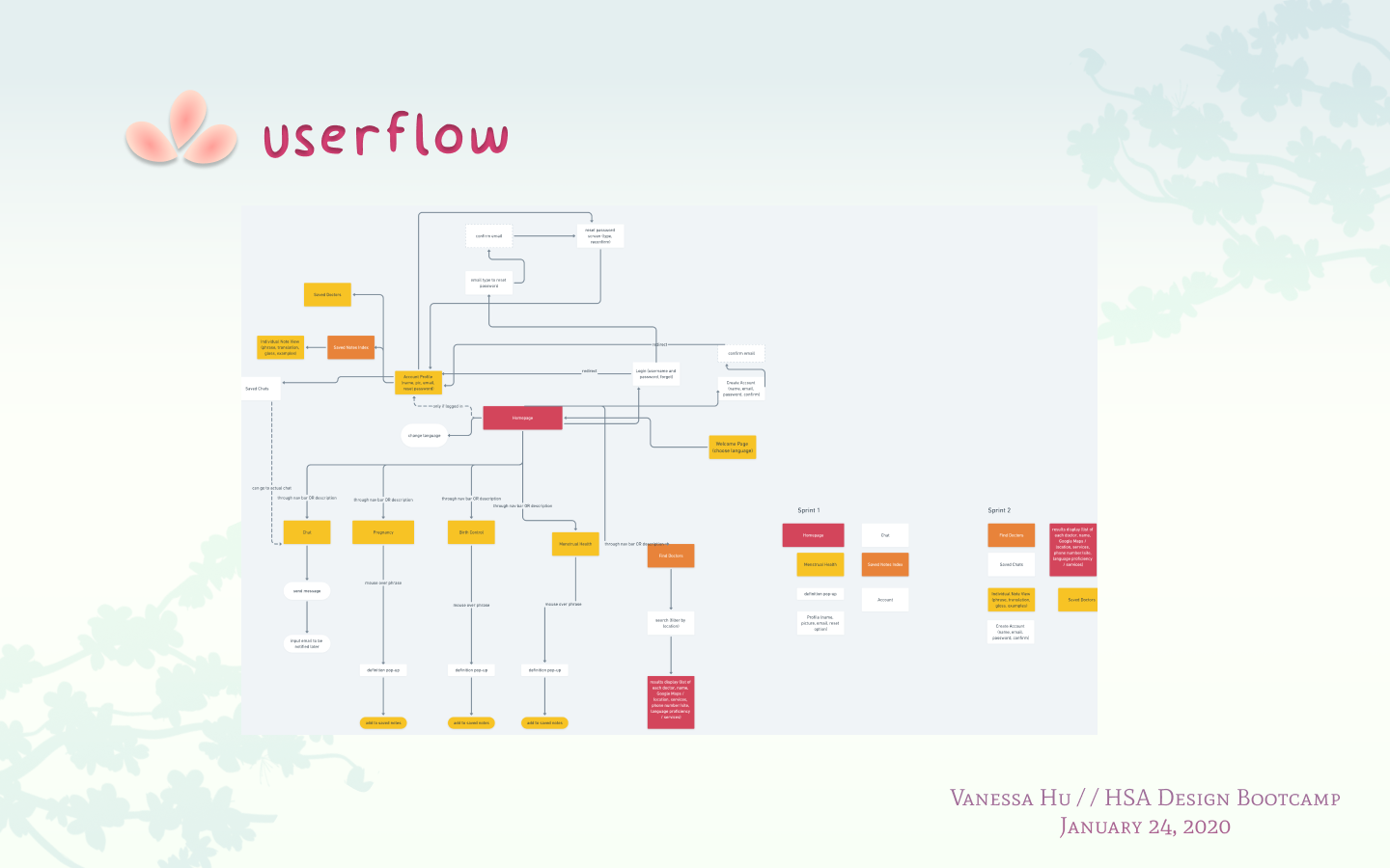
The implementation phase starts with lo-fis: aka, idea sketches that help you idea-vomit and get a visual skeleton of your final design. Free drawing, and multiple sketches of the same idea, are encouraged! Here are some snapshots from my sketchbook, along with my userflow map of the different pages and areas on my site, and how they all, well, flow.
b. mid-fis (?)
Kinda made this word up, but these are basic wireframes in Figma for more brainstorming. Captions are self-explanatory: Design #1 was way too stock-photo-y, but after that, I began to get more creative with a falling trail of petals and a contrast colored landing page.
c. hi-fis!
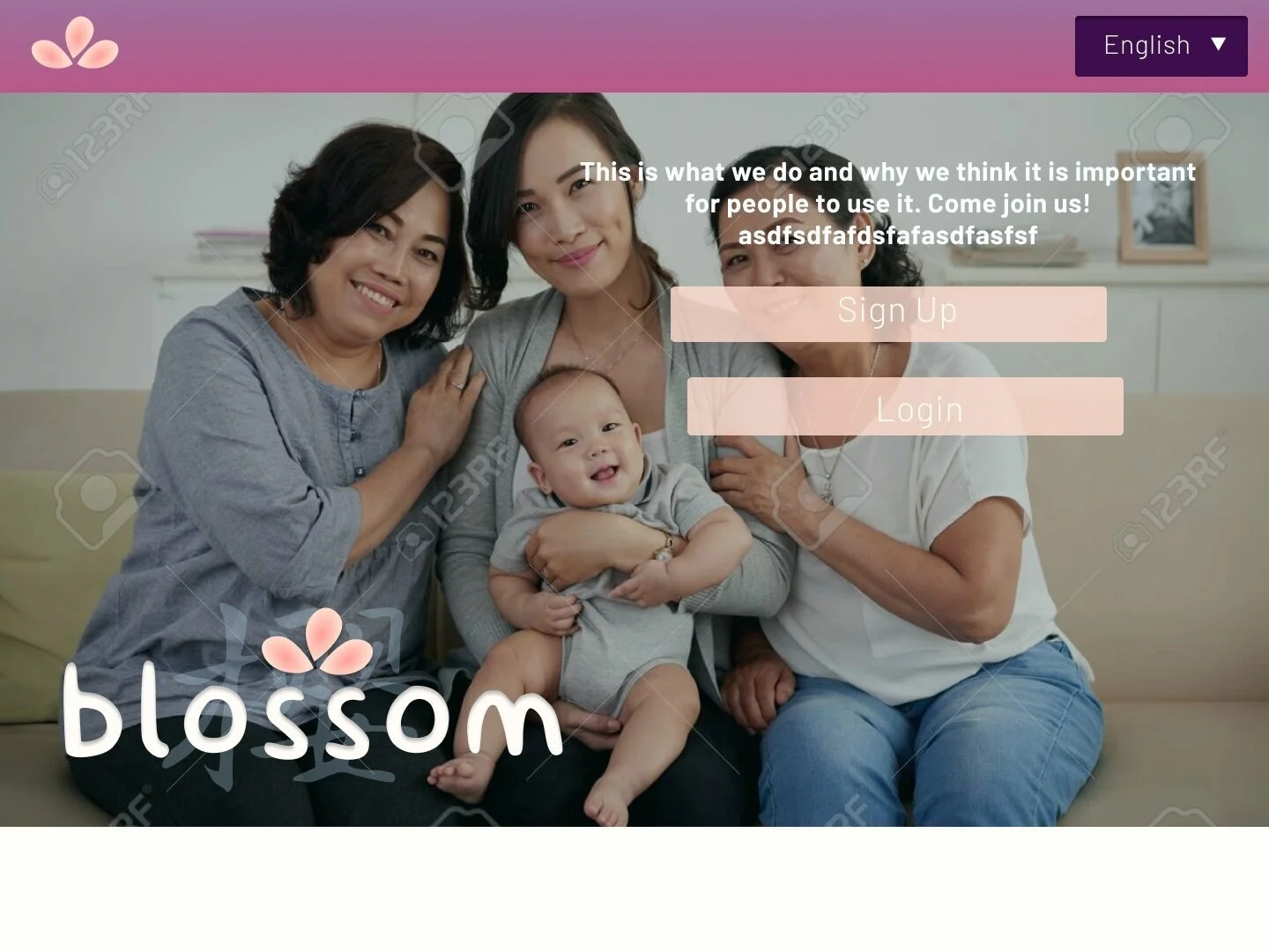
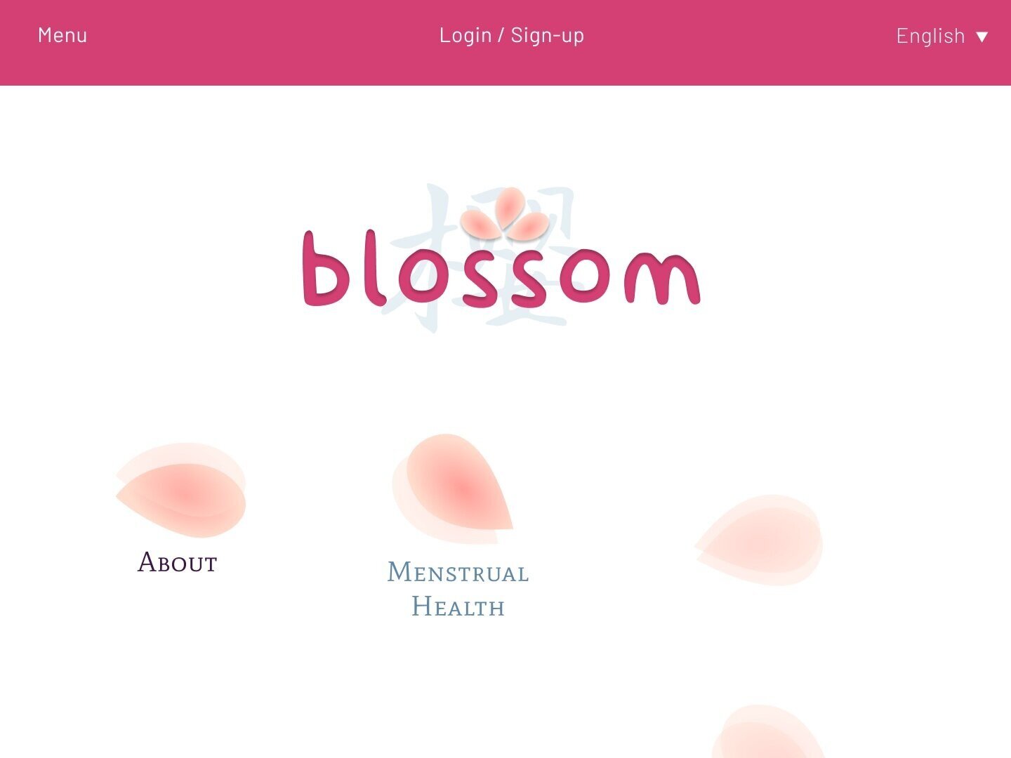
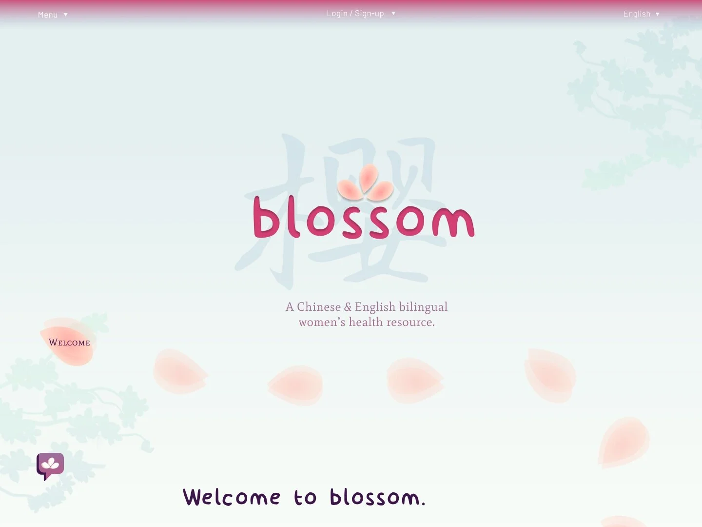
And here it is! My cool landing page (very proud of the blossom branch graphic I made by the way), into my homepage.
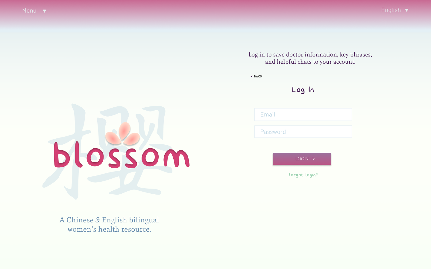
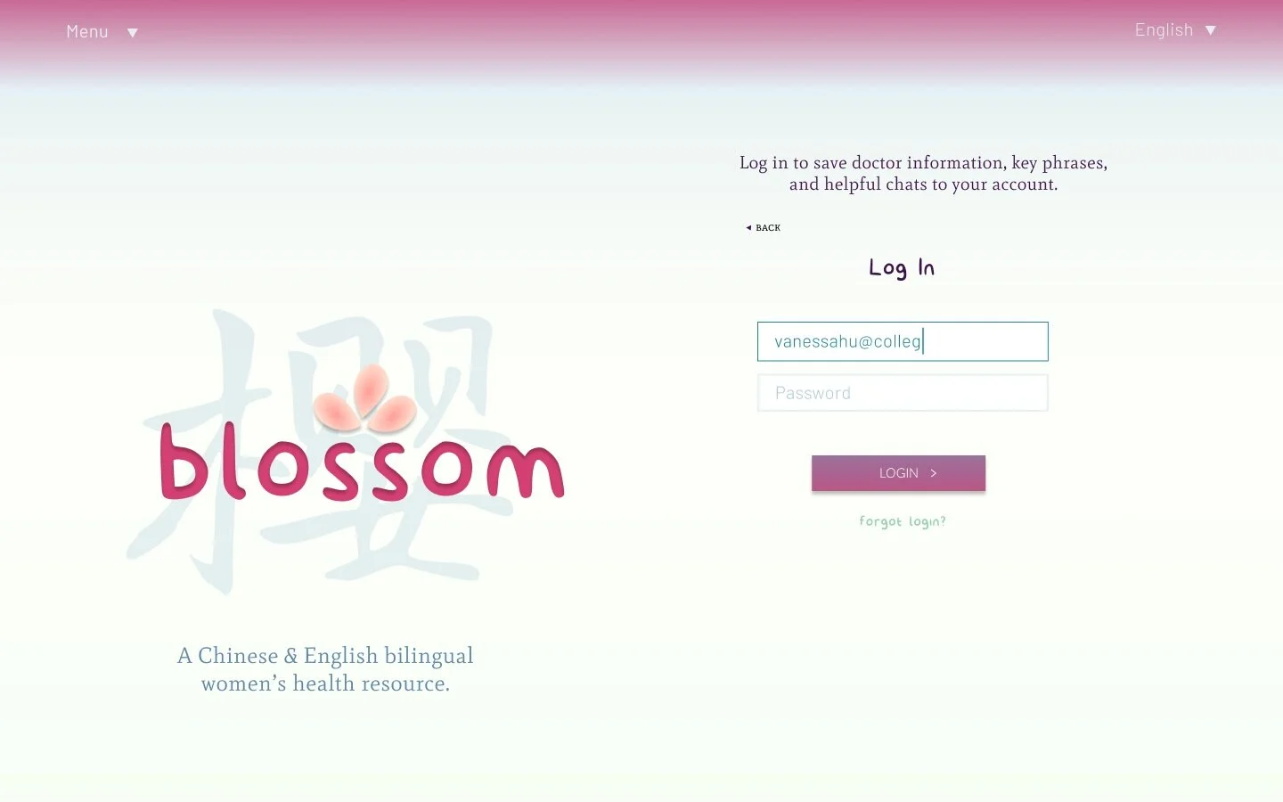
A mockup of the log in page…
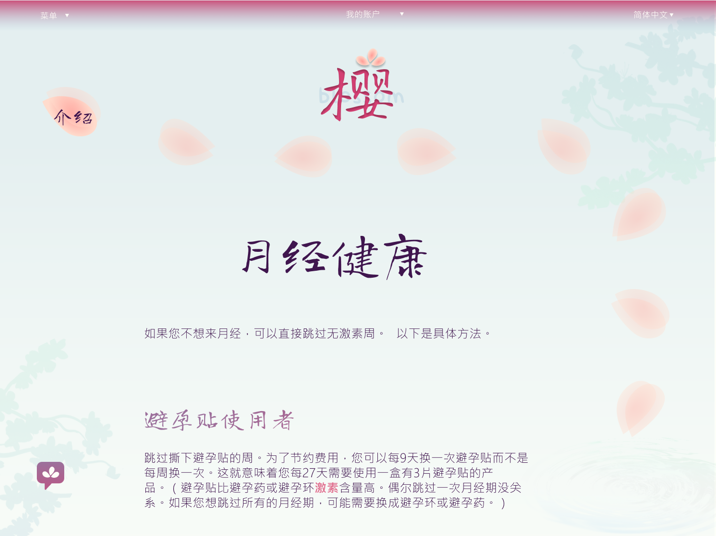
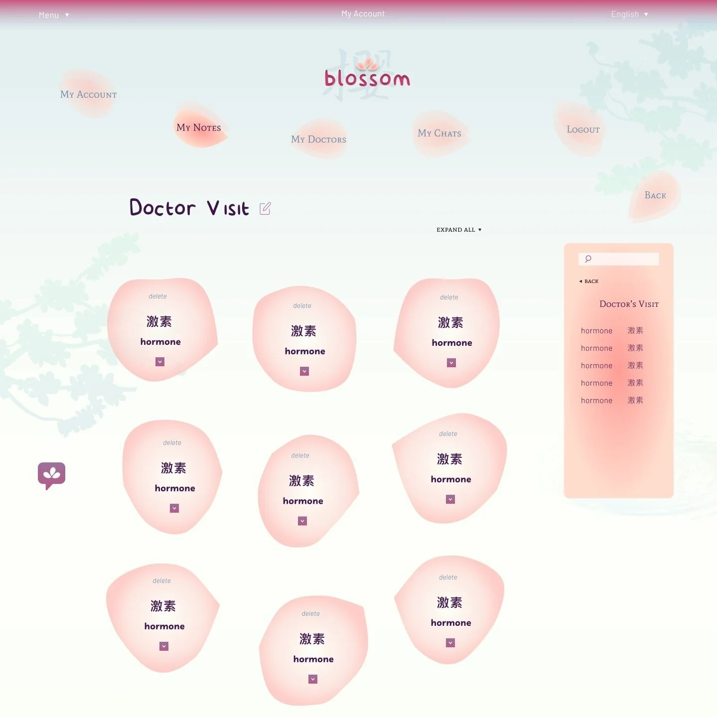
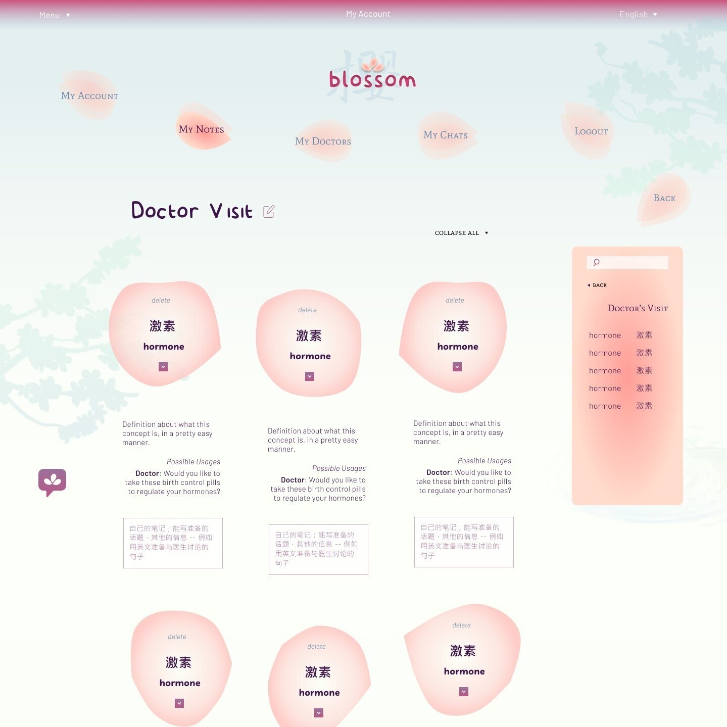
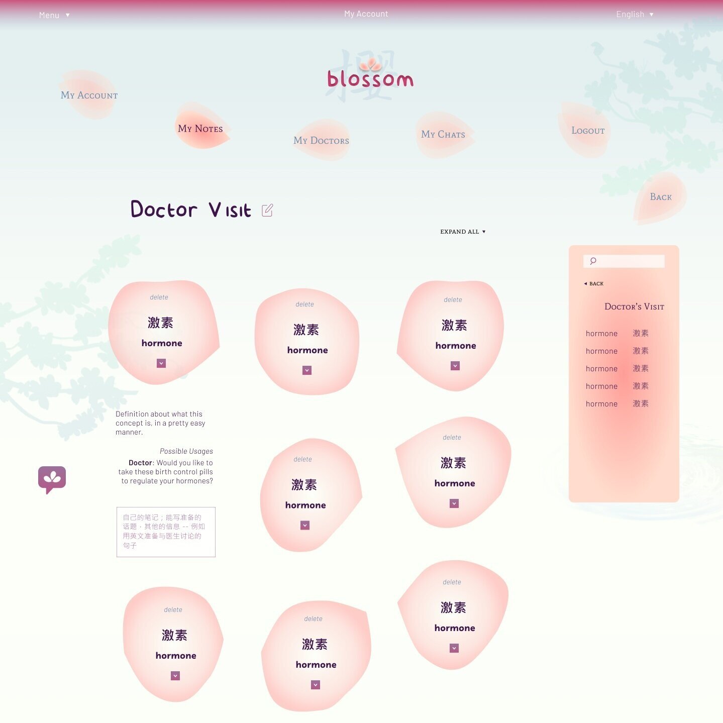
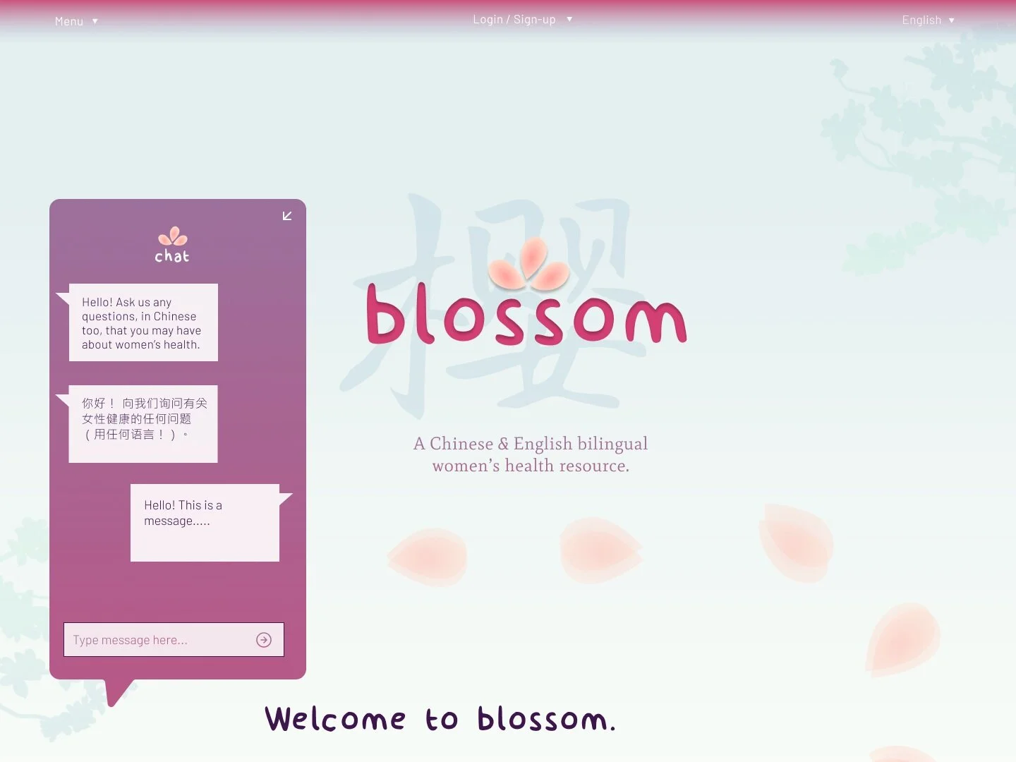
Here, a snapshot of what the Chinese (simplified) website version would look like (note the inverted logo!) Below is an article on menstrual health in Chinese, and key terminology is highlighted. By clicking on the term, users can add to certain lists in their vocab folders, to obtain and review the language they need to better take care of their health.

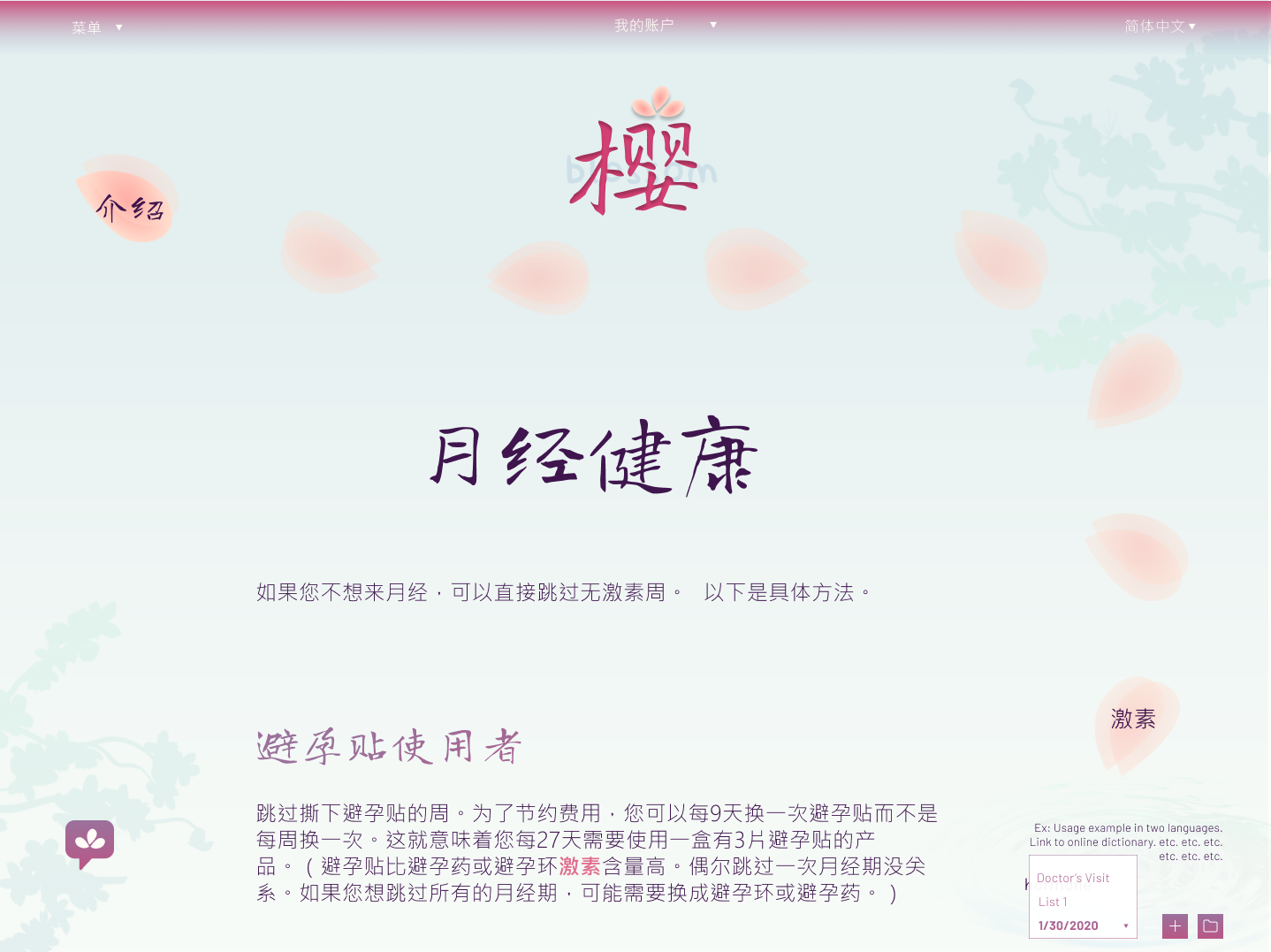

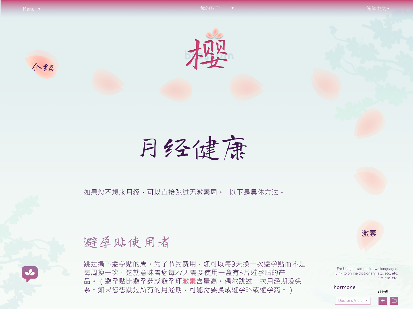
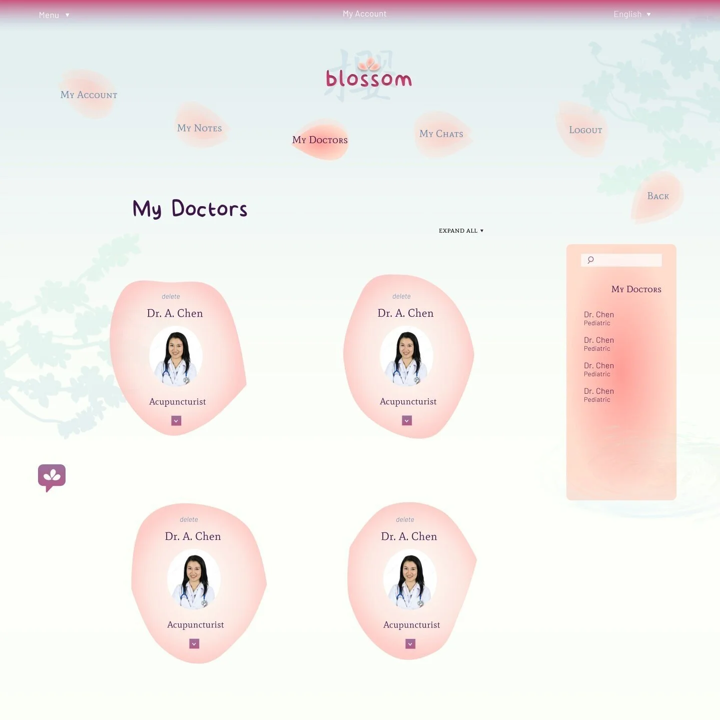
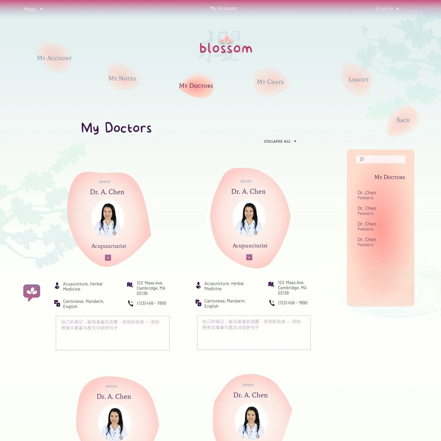
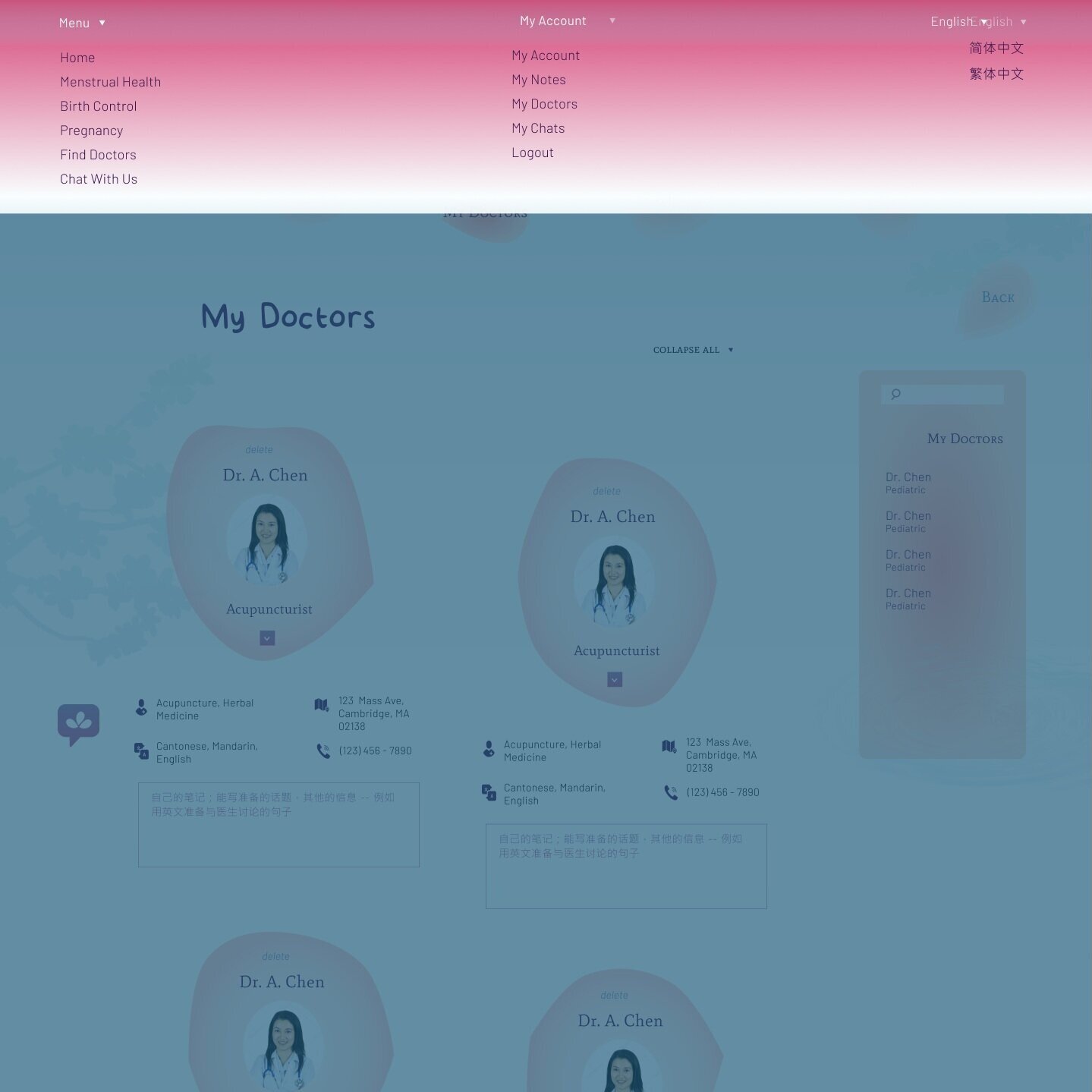
After that, sneak peek at the user account features! Here is the place to store the terms you can use to better communicate your health needs, and a place to store and search up doctors in your area with the language and specific medical services users may seek. Disclaimer against the stock photo of the female Asian doctor!
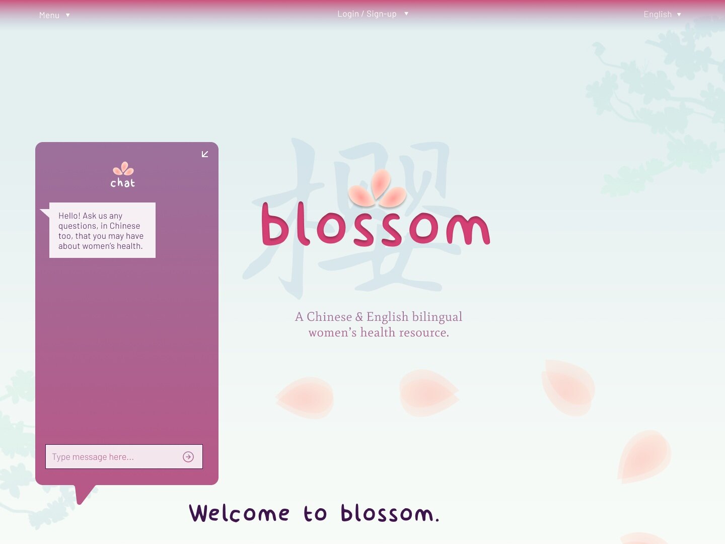
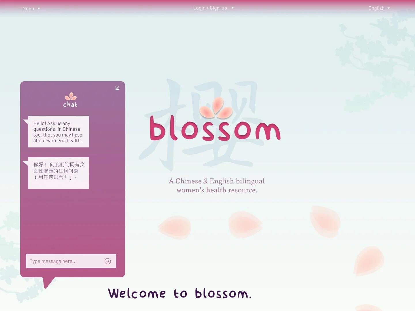
And finally, a cute bilingual site chatbot that answers your questions about women’s health, or directs you to the resources that can answer them for you!

Reflecting back, I ran into many obstacles, such as how I never really learned art with an intent to create (I did take art classes, but mostly copied life drawings), and did not have prior experience with Figma or any of the Adobe Creative Suite, unlike a good portion of my class. Moreover, it was often difficult to balance having something aesthetically fascinating or “unique” in UI, but also having something intuitive and easy to understand and navigate for the user. In particular, I redid the organization of vocabulary and doctors so many times: just many pages of either stacked rectanges, randomly cascading petals, staggered boxes, you name it. Hidden behind that is my eagerness for perfection: the perfect color combination, the perfect fonts, the perfect margins, you name it. But in the design world, especially in designing for a client or product, there isn’t time for that! I just have to trust in what I create, put it out there, and iterate, improve from there.
3. final product + reflection :)
All in all, I am so excited to have had this opportunity to explore creativity and design, but in the context of technology. I had been worried I made the wrong choice of trying this UI/UX Design Bootcamp instead of the simultaneous Web Development Bootcamp — but since I’m planning to major in CS and have dabbled in web dev, I know I”ll have plenty of time for that in the future. Moreover, women’s health is now an issue that is even closer to my heart (check it my blog post here), so I am happy to have had the chance to delve into that area even more.
Having Figma in my toolbox has been an unexpected secret weapon for me, from designing The Wave Literary Arts Magazine’s logo, to designs for the new Instagram I started with my sister, to the most important task of all:
Making cutouts of Tom Holland in Hello Kitty pajama pants.
